
A house that looks expensive is rarely defined by luxury materials alone. More often, it reflects restraint, consistency, and attention to visible details. Many modest homes look high-end because distractions have been removed and key surfaces are treated thoughtfully.
This guide is for homeowners who want practical improvements, DIYers focused on visible results, and investors seeking strong presentation without overspending. The strategies apply to typical U.S. homes and emphasize perception, not luxury construction.
The core idea is simple: homes look “rich” when they appear intentional. Fewer visual flaws, cohesive finishes, and balanced lighting matter far more than price tags. Most of these improvements cost little, but only when effort is applied in the right places.
Key Principles to Understand Before Making Any Changes
People form an opinion about a house almost immediately. That judgment is visual and intuitive, based on what feels unfinished, mismatched, or neglected. Understanding this helps prioritize effort where it actually changes perception.
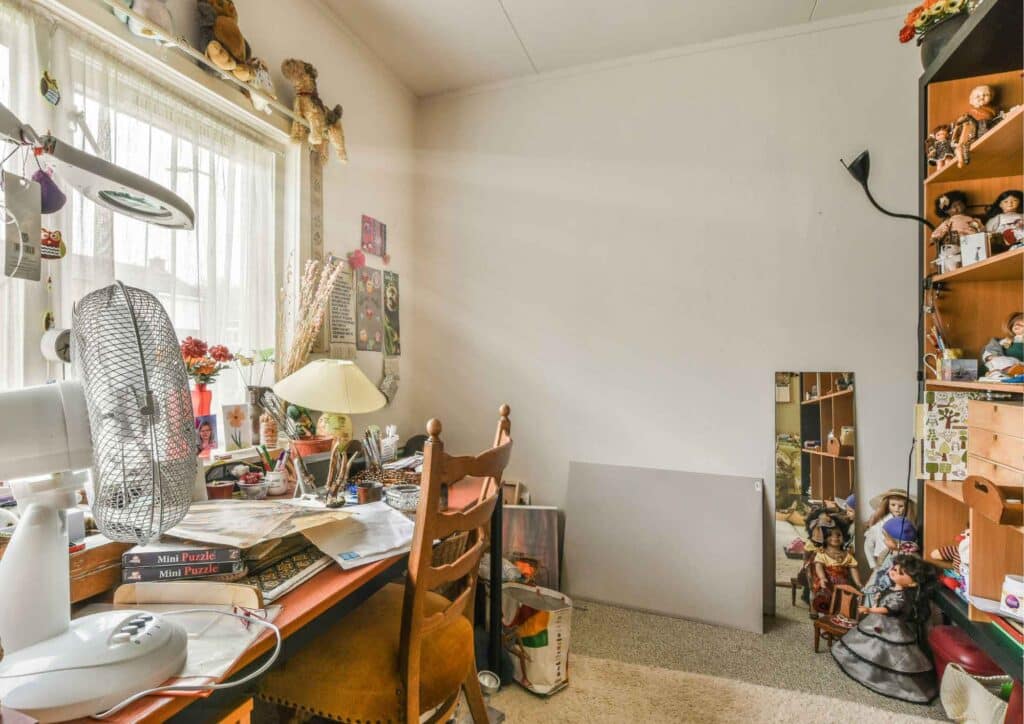
Homes look cheap when they feel accidental. Inconsistent finishes, uneven paint lines, and clutter suggest a lack of care. Even solid materials lose impact if they don’t relate to one another. A refined look comes from visual order, not expensive upgrades.
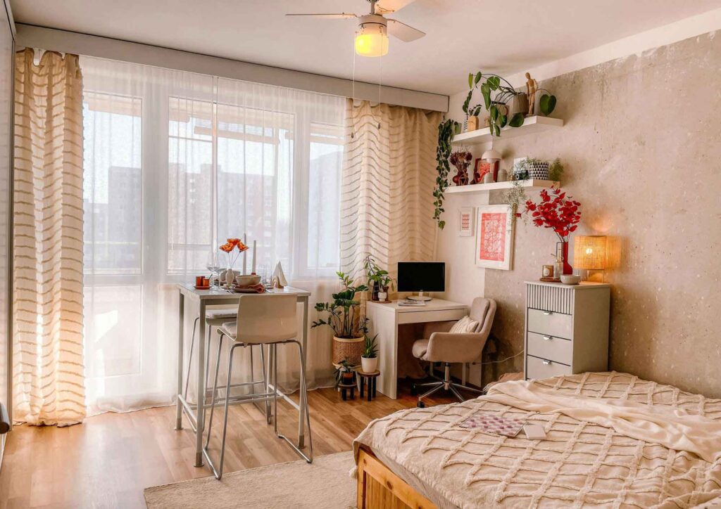
Consistency matters more than standout features. A single high-end fixture surrounded by outdated finishes often highlights what hasn’t been addressed. In contrast, modest but coordinated choices throughout a space tend to read as intentional and well planned.
Many homeowners overspend on upgrades that don’t register visually. Improvements like insulation, premium appliances, or system upgrades are valuable, but they don’t change first impressions. If appearance is the goal, focus on surfaces, lighting, and layout first.
Cosmetic changes also have limits. If a home has structural movement, moisture problems, or visible deterioration, those issues will undermine any visual improvements. Address fundamentals before worrying about aesthetics.
Basic Tools and Materials That Deliver the Most Visual Impact
Most appearance-focused upgrades rely on basic tools. Homeowners who handle routine maintenance likely already own what’s required, which keeps costs controlled and projects manageable.
Common hand tools—screwdrivers, a level, tape measure, and utility knife—are essential for straight installations and clean alignment. Precision matters, because uneven spacing and crooked details quickly cheapen a space. In addition, a hand drill, rivet gun, angle grinder, jigsaw, and a couple of pliers are common DIY tools that almost is a must for a homeowner.
Furthermore, paint results depend more on tools and preparation than on brand. Quality rollers, angled brushes, sanding sponges, and drop cloths produce smoother finishes and sharper lines. Poor tools leave visible marks that undermine even good color choices.
Lighting improvements often require little more than new fixtures, properly matched bulbs, and updated switch or outlet covers. Simply replacing yellowed or mismatched covers can make walls look cleaner and newer.
Organization tools also play a role. Drawer inserts, matching bins, and cord management systems reduce visual clutter. A space that looks organized almost always appears more expensive, even when nothing else changes.
A Practical, Step-by-Step Approach to Elevating Your Home’s Look
Step 1 – Remove Visual Distractions That Undermine Perceived Quality
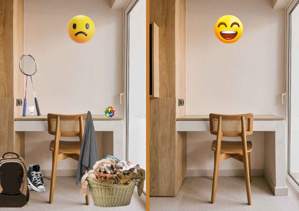
The fastest way to elevate a home’s appearance is to remove excess. Visual clutter makes rooms feel smaller, darker, and less deliberate. High-end homes typically show restraint, even when fully furnished.
Start with flat surfaces. Kitchen counters, bathroom vanities, and entry tables should hold only daily-use items. Excess appliances, toiletries, and decor create visual noise and distract from the space itself. A dedicated
Identify items that visually date the house. Worn rugs, novelty decor, mismatched throw pillows, and outdated wall art often drag a room down. Removing them frequently improves the space more than replacing them.
Furniture placement also affects perceived quality. Pieces shoved against walls or blocking walkways make rooms feel awkward. Clear circulation paths and balanced spacing help even basic furniture feel intentional.
Finally, conceal what doesn’t need to be seen. Exposed cords, power strips, pet supplies, and cleaning tools signal disorder. When everyday items are hidden, rooms feel calmer and more refined without any cost.
Step 2 – Refine the High-Visibility Surfaces That Define First Impressions

Walls, floors, and fixed surfaces dominate visual perception. While people may not consciously focus on them, flaws here stand out immediately. Improvement often comes from repair and refinement, not replacement.
Paint remains one of the highest-impact upgrades. Neutral, warm tones with consistent sheen create a clean backdrop and help hide minor imperfections. Overly bright whites or dark colors tend to highlight flaws and limit flexibility.
For a good finish, remove the old cracked paints if visible before adding new coats. This will preserve the new coating in the long run.
Trim and doors are often overlooked but highly visible. Scuffed baseboards, chipped frames, and yellowed doors quietly reduce perceived value. Cleaning, repainting, or refreshing these elements improves the overall finish of a room.
Floors don’t need to be new to look good. Uniformity and condition matter more than material. Properly sized rugs, consistent transitions, and repaired edges make existing flooring feel intentional rather than worn.
Cabinet faces, shelving, and built-ins sit at eye level and receive heavy use. Simple updates—repainting, aligning hardware, or removing overly decorative elements—can modernize these features quickly. Crooked handles and uneven gaps suggest neglect.
Step 3 – Use Lighting, Hardware, and Proportion to Create Visual Cohesion
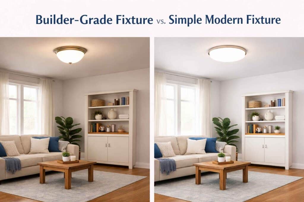
Lighting strongly influences how materials and colors are perceived. Poor lighting dulls finishes, while balanced lighting elevates even basic surfaces. The goal is consistency, not maximum brightness.
Standardize light color throughout the house. Mixing cool and warm bulbs creates visual tension. Most homes benefit from soft white or warm white lighting that resembles natural daylight without appearing yellow.
Replace builder-grade fixtures where they’re most visible, such as entryways, dining areas, and main living spaces. Simple, well-proportioned fixtures usually look more expensive than ornate designs that overwhelm the room.
Hardware functions as visual punctuation. Cabinet pulls, doorknobs, and faucets should share a finish or belong to the same style family. Consistency across these elements helps the house read as cohesive.
Balance and symmetry also matter. Matching lamps, centered artwork, and evenly spaced furniture create visual order. Spaces that feel organized and intentional tend to feel more expensive.
The Single Scent-Related Detail That Complements a High-End Appearance

Smell influences perception, but in well-presented homes it’s rarely noticeable. The goal isn’t fragrance—it’s neutrality. When a house smells clean and unremarkable, attention stays on how it looks.
Effective odor control comes from maintenance, not scenting. Clean soft surfaces, change HVAC filters regularly, and ensure kitchens and bathrooms ventilate properly. These steps prevent odors instead of masking them.
Strong or mixed air fresheners often raise suspicion, especially in older homes. Neutral air signals cleanliness and care, reinforcing the visual impression rather than competing with it.
Costly Missteps That Make Homes Look Cheaper Than They Are
Adding too much is a common misstep. Extra decor, bold finishes, and statement pieces often make spaces feel cluttered. High-end interiors usually rely on fewer elements used deliberately.
Mixing styles without a plan also undermines results. Modern fixtures paired with traditional trim and rustic furniture create visual conflict. Even inexpensive materials look better when they belong to a coherent style.
Small defects are often underestimated. Crooked switch plates, uneven paint lines, and loose hardware are inexpensive to fix but very noticeable when left alone.
Trend-chasing can backfire. Heavily adopting current styles often dates a house quickly. Timeless colors and simple forms tend to age better and maintain a “rich” look longer.
Finally, many homeowners spend money where it doesn’t show. Hidden upgrades matter for performance, but they won’t change perception. If appearance is the goal, focus on what’s visible.
Safety, Code, and Compliance Factors to Keep in Mind
Cosmetic work still requires basic safety awareness. Use ladders correctly, secure them on stable surfaces, and avoid overreaching when working overhead. Falls are one of the most common homeowner injuries.
Lighting changes should be approached carefully. Fixtures must be compatible with their electrical boxes, and wiring should never be forced. Loose fixtures or damaged wiring are signs to stop and reassess.

U.S. electrical codes require specific protections in kitchens, bathrooms, garages, and basements. Replacing visible components may expose existing issues that need correction.
Older homes may contain lead-based paint. Sanding or scraping painted surfaces in pre-1978 houses should be done carefully to limit dust exposure and ensure proper cleanup.
Visible changes may also be restricted by HOAs or rental agreements. When cosmetic updates cross into electrical, structural, or exterior work, permits or licensed professionals may be required.
Common Questions Homeowners Ask About Making a House Look Expensive
How do I make my house look rich on a small budget?
Remove distractions first. Clean lines, consistent finishes, and good lighting have more impact than expensive materials.
What upgrades give the biggest visual impact for cheap?
Paint, lighting, and hardware typically offer the strongest return because they affect large, visible areas.
What makes a house look expensive but isn’t?
Simple fixtures, neutral finishes, and uncluttered spaces often look high-end despite modest costs.
Do paint and lighting really matter that much?
Yes. Paint sets the backdrop, and lighting determines how everything else is perceived.
What do buyers notice first?
Entryways, wall condition, flooring consistency, and lighting quality stand out immediately.
How do investors make homes look high-end quickly?
They standardize finishes, correct visible defects, and keep designs simple and repeatable.
Can an older house still look rich?
Yes. Older homes often benefit from preserved details, consistent updates, and respect for original scale.
Final Takeaways and Situations Where Professional Help Makes Sense
Before calling a project finished, walk through the house with fresh eyes. Anything that feels uneven, unfinished, or distracting likely deserves attention.
Maintain the look by keeping surfaces clear, touching up paint, and tightening hardware. These small habits preserve the effect better than adding new items.
DIY works best for visible, reversible changes. When projects involve wiring, structure, moisture, or uneven floors, professional help usually prevents costly mistakes.
The key takeaway is straightforward: a house looks expensive when it feels intentional and well maintained. With careful choices and attention to visible details, it’s entirely possible to make your house look rich for cheap—without major renovations or wasted spending.